
☙ Font Foundry ❧
Thoreau’s Hand
A digital font family based on
the handwriting of Henry David Thoreau
On this page:
- The Tribulations of a Thoreauvian Font
- Handwriting-Font Comparisons
- Free Font Downloads
- Preview (and Try!) the Fonts
The Tribulations of a Thoreauvian Font
Scholars and devoted fans of American Transcendentalist author Henry David Thoreau are well-familiar with the fact that his penmanship could hardly be said to be a sight for sore eyes — indeed, his writing style (or lack of) was rather more likely to be the direct cause of such an affliction.
I mean, have you seen Thoreau’s handwriting? Just look at it! Oh, the horrors!
We have here (below) a short excerpt from Thoreau’s journals, showing a fairly typical example of his scrawl. With a little effort, one can decipher his really quite eloquent words — a lovely little self-contained passage in which ol’ Henry strolls down to the pond in the moonlight, marvelling in mystical rapture at the shimmering reflection of light upon the waters — but only just barely can we make it all out.
Click the images on this page to view in high‑resolution.
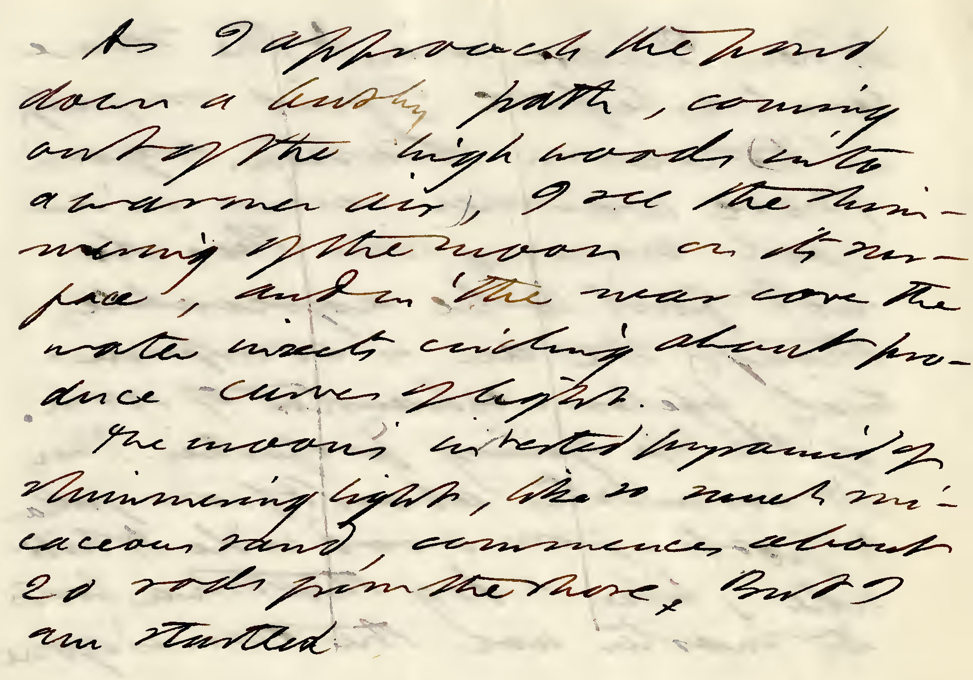
Source: Excerpts from Journal, by Henry David Thoreau (July 8, 1851)
Henry’s vain strivings for illegibility were not partial to only his own private journal musings, mind you, for we can see that even his closest friends were not immune from his torture...
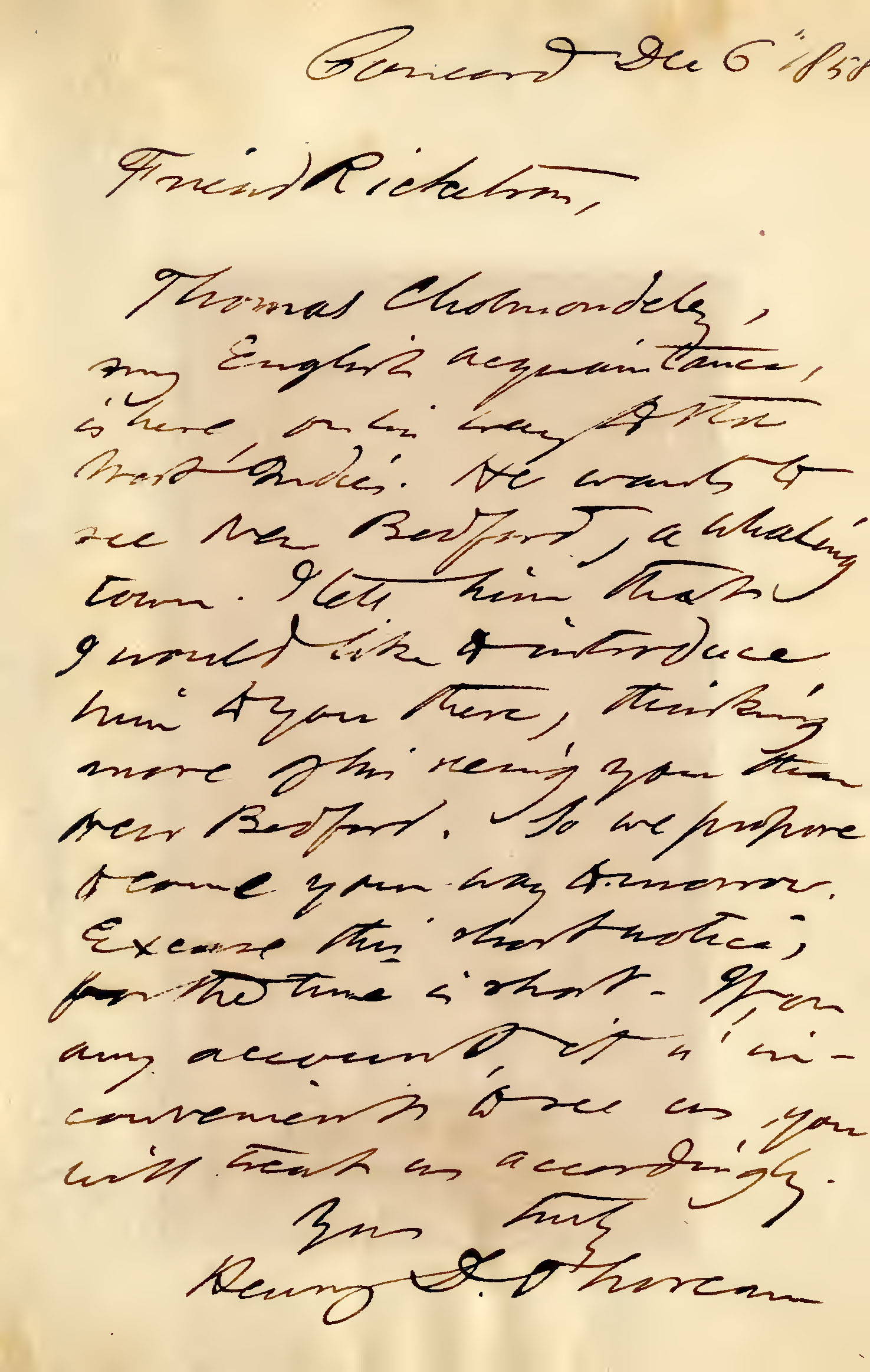
Source: Letter to Daniel Ricketson, by Henry David Thoreau (December 6, 1858)
As stated earlier, however, these latter two examples are rather “typical” for Thoreau, as far as legibility goes, but within his journals, especially, there were many passages — if not entire pages — where one might find oneself led into a nightmarish quagmire of impenetrable scribbles...
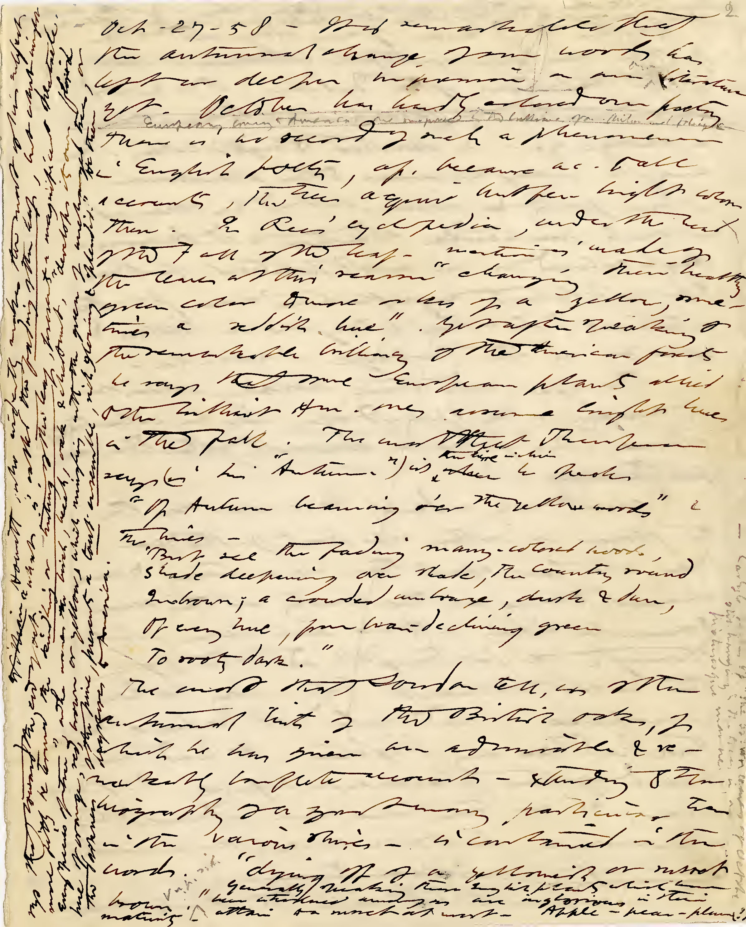
Source: Journal Transcripts, by Henry David Thoreau (October 27, 1852)
How on earth could one possibly ever make a font out of that!?
Nevertheless, when I first dipped my toe in the field of type design back in the 1990s, one of my very first wishes was to create a font out of the handwriting of this great mentor of my life, whose works have inspired me and guided me since my youth — but I just never found the motivation necessary to even bother to try, because not only did I firmly believe that it just simply wouldn’t be practically possible to make a font out of that handwriting, but even if one could, who in this world would have any sort of use for a font that’s near-indecipherable?
And so, as the years went by, I gave nary a thought to this seemingly-insurmountable conundrum, just put it largely out of my mind completely — until two decades later, when I stumbled upon some examples of Thoreau’s college essays (undoubtedly well-known to scholars, I’m sure, but new to me), written when he was a studious young man just entering his 20s while attending Harvard.
What a marvellous, joyful discovery those college essays were for me!
Here we had Thoreau at a time in his life when clarity, consistency and legibility mattered much more to him (no doubt to please his instructors, if anyone), in which we find him not only putting much more effort into writing evenly and consistently, but even taking the time to add in curly, decorative swashes to many of his uppercase letters (in addition to his usual habit of adding swashy ascenders at the ends of words).
At last, here were samples of Thoreau’s handwriting that I could potentially work with, where I actually saw some hope to create a font!
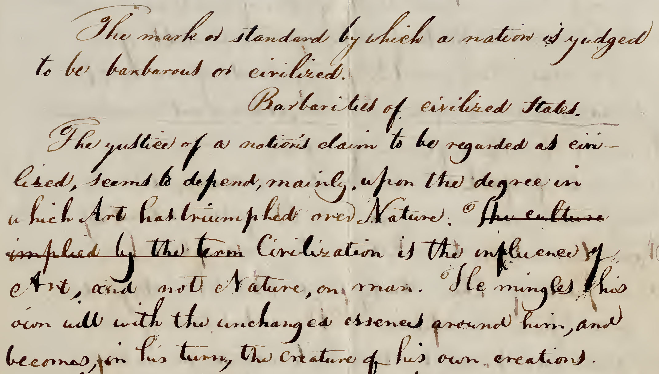
Source: College Essay on “The Barbarities of Civilized States”, by Henry David Thoreau (June 2, 1837)
What piqued my enthusiasm to embark on this endeavour even more, however, was that within those college essays were found not only many examples of Thoreau writing quite legibly in his usual oblique style — i.e. at a fairly pronounced slant (like italics) — but there were other times when he wrote quite upright, almost vertically, too.
In fact, the previous image is a perfect example of both styles, where we see that Thoreau begins the passage writing obliquely, at quite a steep angle, but with each line his script becomes increasingly upright.
There are, of course, numerous other examples of both styles from Thoreau’s writings during his college days, but overall he did tend to write obliquely. Nevertheless, within those college essays, I discovered the potential to create both an “Oblique” font — which would be most closely reflective of Thoreau’s handwriting throughout most of his lifetime (persistent illegibility aside, of course) — as well as its companion “Regular” font, one which quite happily wasn’t just merely invented from scratch, without any template for a source, but which also arose directly from Thoreau’s own penmanship as well.
And so was born Thoreau’s Hand, a family of 4 fonts based directly on the youthful handwriting of Henry David Thoreau:
Thoreau’s Hand Regular
For all your upright declarations.
Thoreau’s Hand Bold
For a little more “Oomph!”
Thoreau’s Hand Oblique
For when you really want to be especially Thoreauvian.
Thoreau’s Hand Bold Oblique
For more “Oomph” — and emphasis, too!
It should perhaps be noted that Thoreau’s Hand Oblique was the first font which I made, as my initial ambition went no further than to create a single font that would hopefully be reflective of Thoreau’s handwriting style for the majority of his lifetime (or, at least, his young adulthood) — that is, one that was slanted — and once that was accomplished I was quite thrilled to discover that Thoreau’s own more “upright” writing style could be replicated simply by skewing over that oblique font.
Thus, typographically-speaking, Thoreau’s Hand Regular is technically the oblique of Thoreau’s Hand Oblique, and not the other way around as one might normally think — but if only to allay any confusion among users of the fonts, I named each font style based on their visual appearance (slanted or upright), not on their origins.
Regardless, it is most certainly worthy of mention that quite nearly every single character in these fonts had its origins in Thoreau’s own handwriting — the entire multinational extended character set was accomplished by creating accents out of the scribbles and insert marks which Thoreau penned himself. The only exceptions to this were for a handful of foreign or archaic characters which were outside of Thoreau’s vocabulary or need (thorn, eth, long-s, etc.), or more modern characters which simply did not exist in his time (like the @-sign) — but even all these were created directly out of genuine “Thoreauvian parts.”
(Note that a few additional proprietary symbols have also been included — for example, the long-fingered pointy hand, etc., that you can see used in the “Dracula Pillow Talk” sample text in the font previewer, below — which appear in all fonts made here at Psymon.)
✾
Handwriting-Font Comparisons
The first two images here each show a sample of Thoreau’s handwriting from his college essays, writing in his usual oblique style, along with the same text transcribed in Thoreau’s Hand Oblique.
Note that in all the following handwriting-font comparisons, both ligatures and contextual alternates have been turned on for the font.
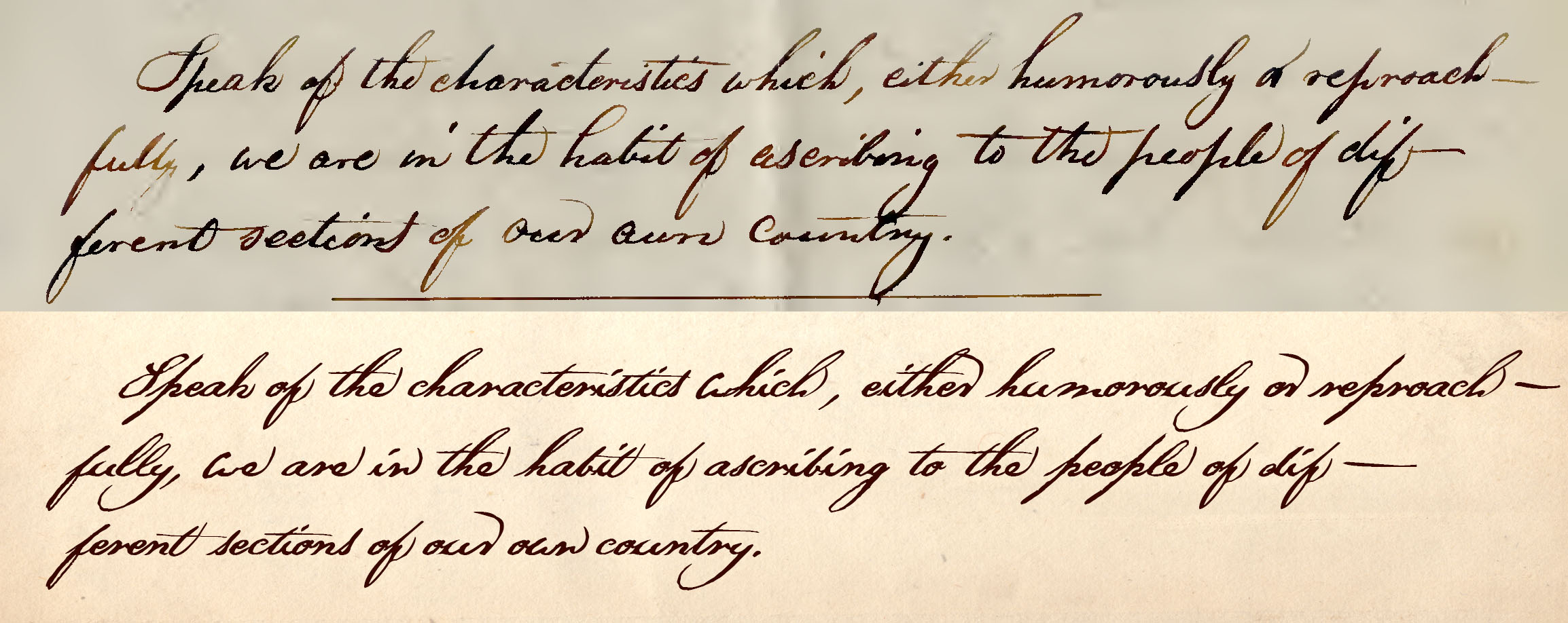
Source: College Essay on “Characteristics of the People of Different Sections of Our Own Country”, by Henry David Thoreau (February 17, 1837)
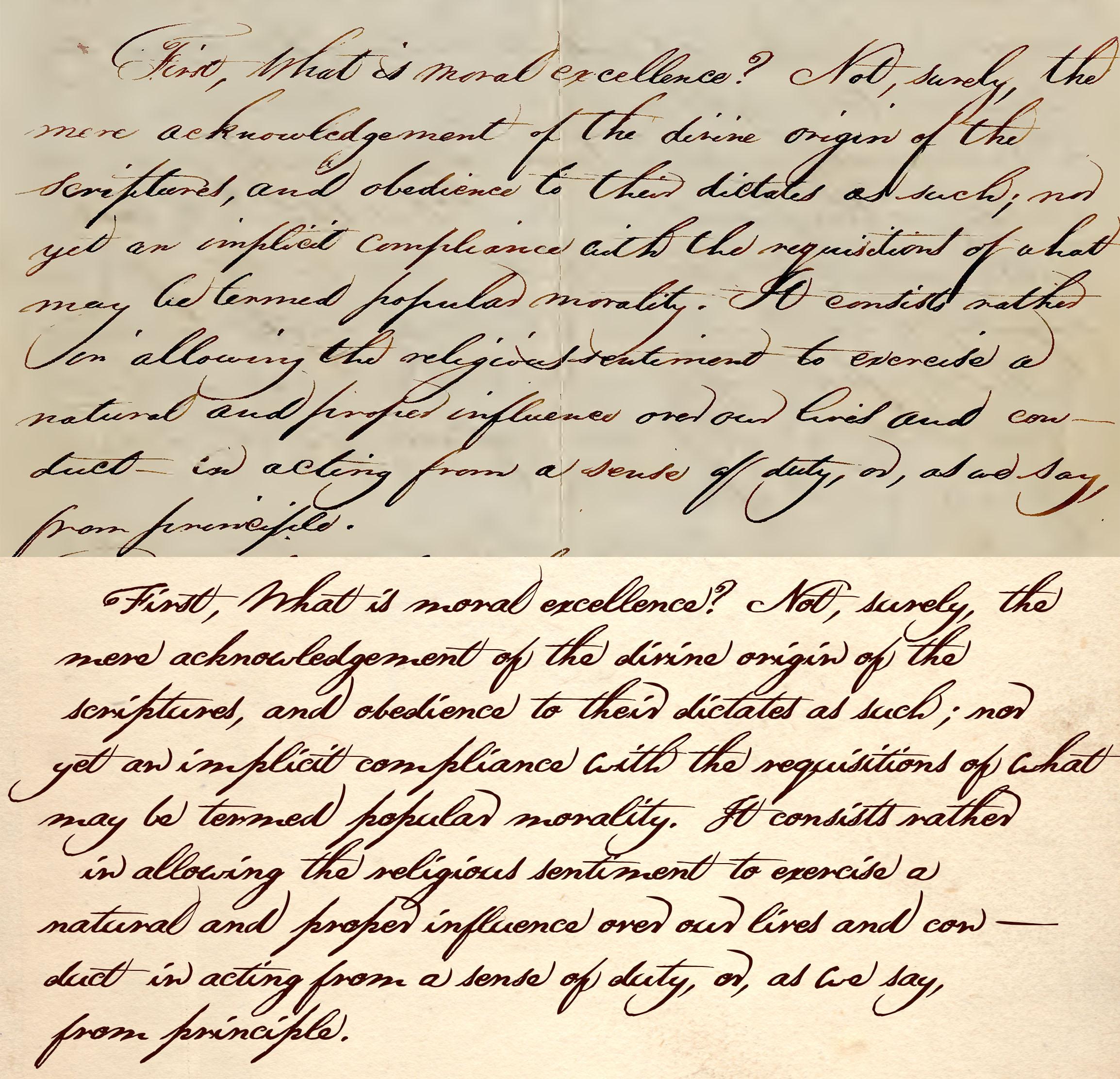
Source: College Essay on “Moral Excellence and Intellectual Power”, by Henry David Thoreau (February 17, 1837)
The following image shows a sample of Thoreau’s handwriting from his college essays when he was writing in an upright (non-slanted) style, along with the same text transcribed using Thoreau’s Hand Regular.
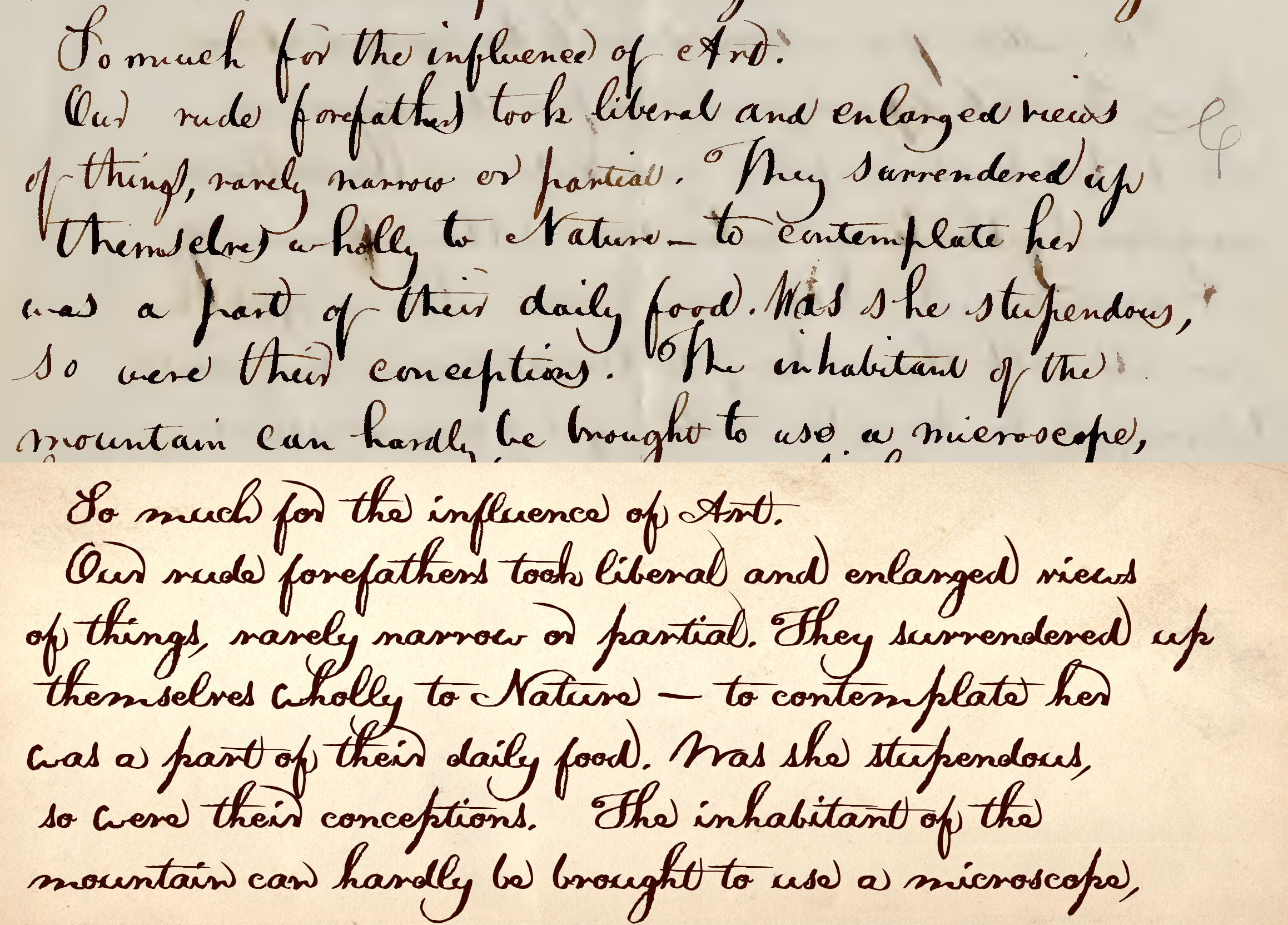
Source: College Essay on “The Barbarities of Civilized States”, by Henry David Thoreau (June 2, 1837)
The above handwriting-font comparisons will be updated
whenever the respective fonts are updated.
✾
Free Font Downloads
Thoreau’s Hand
Version 1.05
Each of the zip files below include all 4 font weights and styles.
Scroll down just a little more on this page if you’d like to preview (and try!) all 4 fonts before you download!
Each Font Includes:
Basic & Extended Latin Character Sets
Standard Fractions
Numerous Symbols
plus more than 50 ligatures
and alternates!
Download Desktop Fonts (TTF)
Download Web Fonts (WOFF)
View Oblique Character Set (PDF)
View Regular Character Set (PDF)
![]()
✾
You may also like
and
Falsum is useful in conjunction with Thoreau’s Hand
if ever you might need to write in ALL CAPS.
✾
Preview (and Try!) Thoreau’s Hand
Try out all 4 fonts in the Thoreau’s Hand font family before you download/install them! Type in anything you’d like in the “Input” field below, and you’ll see the result in the “Preview” underneath. Alternatively, you can select from a variety of sample texts also provided for convenience.
Note that the preview here initially defaults to Thoreau’s Hand Oblique, as that is the font which most closely resembles Thoreau’s most common handwriting style — however, you can change the preview text to any of the 4 fonts in this family at any time, of course.
The font preview script on this page has been adapted from the WOFF test script for FontCreator professional type design software. Many thanks to Erwin Denissen and High-Logicfor kind permission to use it here on this site!
Questions? Comments? Bug report?
☞ Contact Psymon
All text, graphics and web design of this entire site
are copyright © Ron Koster / Psymon
and may not be reproduced or distributed in any manner
without explicit permission of Ron Koster / Psymon.
All Rights Reserved.
Questions? Comments? Bug report?
☞ Contact Psymon ☜
All text, graphics and web design of this entire site
are copyright © Ron Koster / Psymon, 1998-2021 (except as otherwise noted)
and may not be reproduced or distributed in any manner
without explicit permission of Ron Koster / Psymon.
All Rights Reserved.
